
Our next stop in our journey down memory lane is the multilingual wayfinding signage designed for the Russian Rail network back in 2012. Owned by Russian Railways (RZD), this is the 2nd largest rail system in the world with over a billion passengers every year with 128,000Km of track, spanning 11 time zones.
Following a rebrand, RZD undertook to upgrade the wayfinding and signage system throughout this vast network. In terms of sheer scale, this is to date the biggest signage system we’ve worked on. Led by Ian Wright (the I in Air), it went on to pick up the gong for the Multiple Language and Multi-Script Signing Award by SDS in 2013.
Throughout the project, we worked with PR company, Mikhailov & Partners, who were the communication link between Air and RZD with Serjey Sharyukov being a vital part in helping us communicate all ideas throughout the project’s development.
If you’re up for a more detailed description of the signage system, read on…
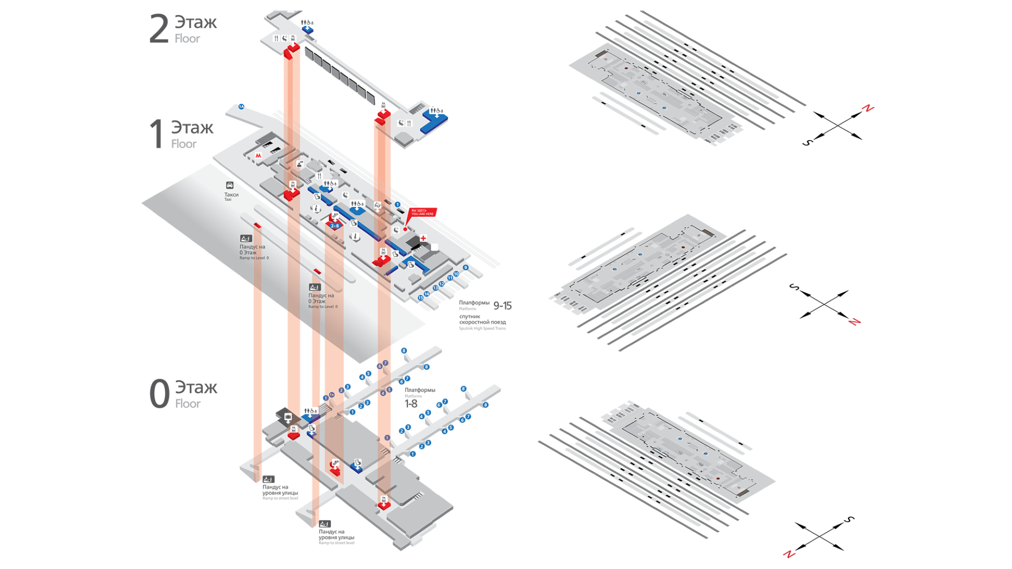
The stations across Russia are very diverse ranging from tiny halt stations to the Victorian, celestial stations such as Vitebsky Station, the first ever Russian station built in 1837, through to the large urban hub stations such as Moscow Kazansky, the largest in Russia at 120,000 sqm and with over 100,000 passengers a day. All used different signage systems proving that although this project prospect was exciting, it certainly wasn’t for the fainthearted.
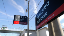
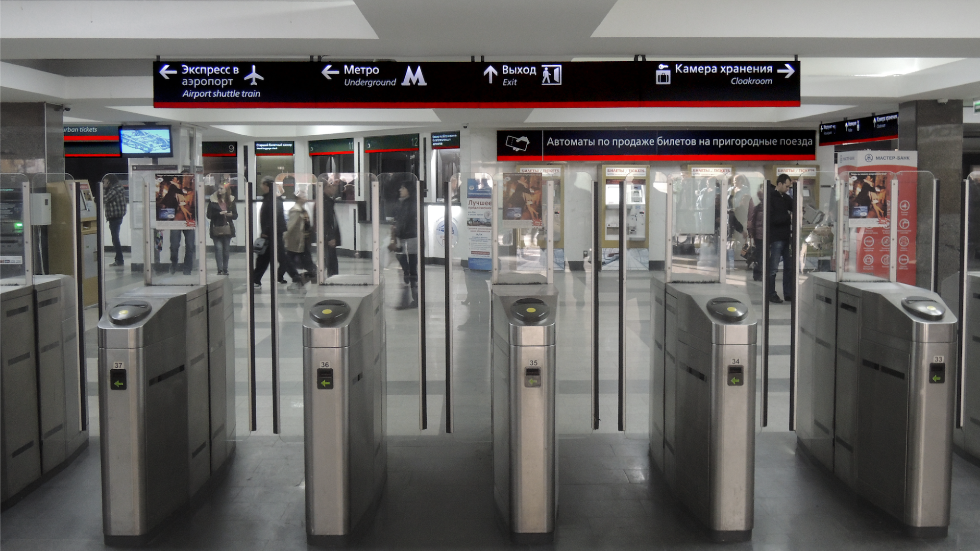
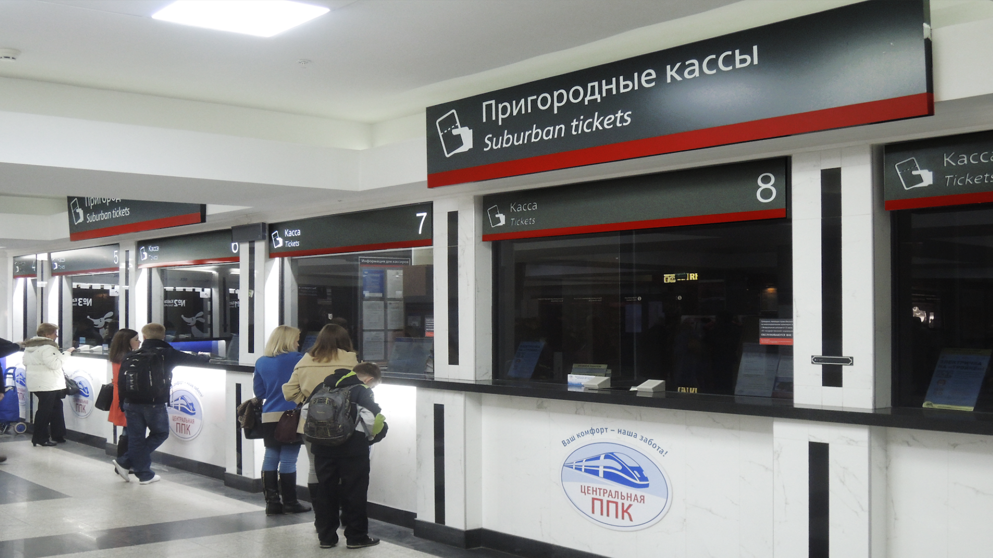
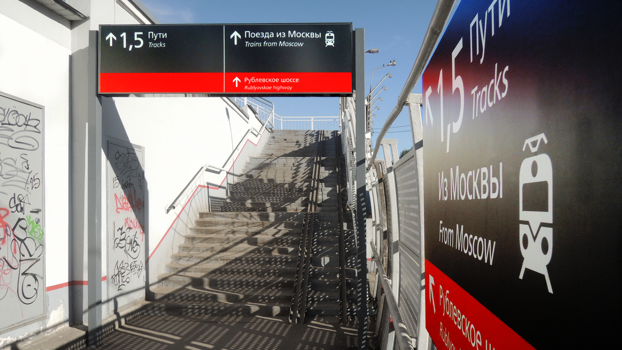
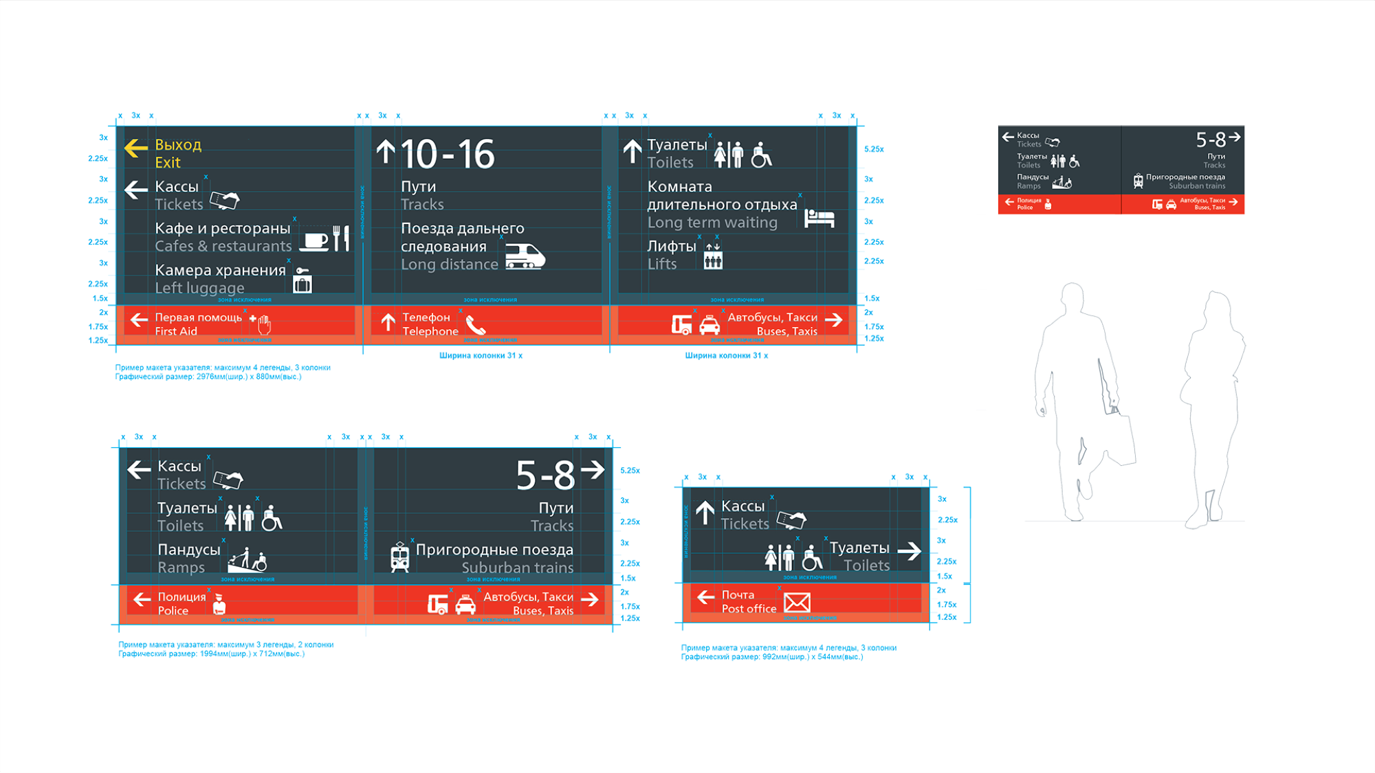
Whilst Russian is the Federal language there are also a further 26 official languages of the Russian Republics. So, the system needed to cope with this multiplicity, dependent upon region. The design specifies dual language, Russian (Cyrillic) and English (Roman), in all instances. Russian is shown first with the secondary language beneath and English italicised as an additional point of differentiation, given both are reversed in white. The grid allows for vertical expansion to include a third language dependent upon region. Interestingly, the 3rd script used a different alphabet again (e.g. Georgian) so a change in colour is not required. This allowed us to keep to a consistent, universal 3 colour system.
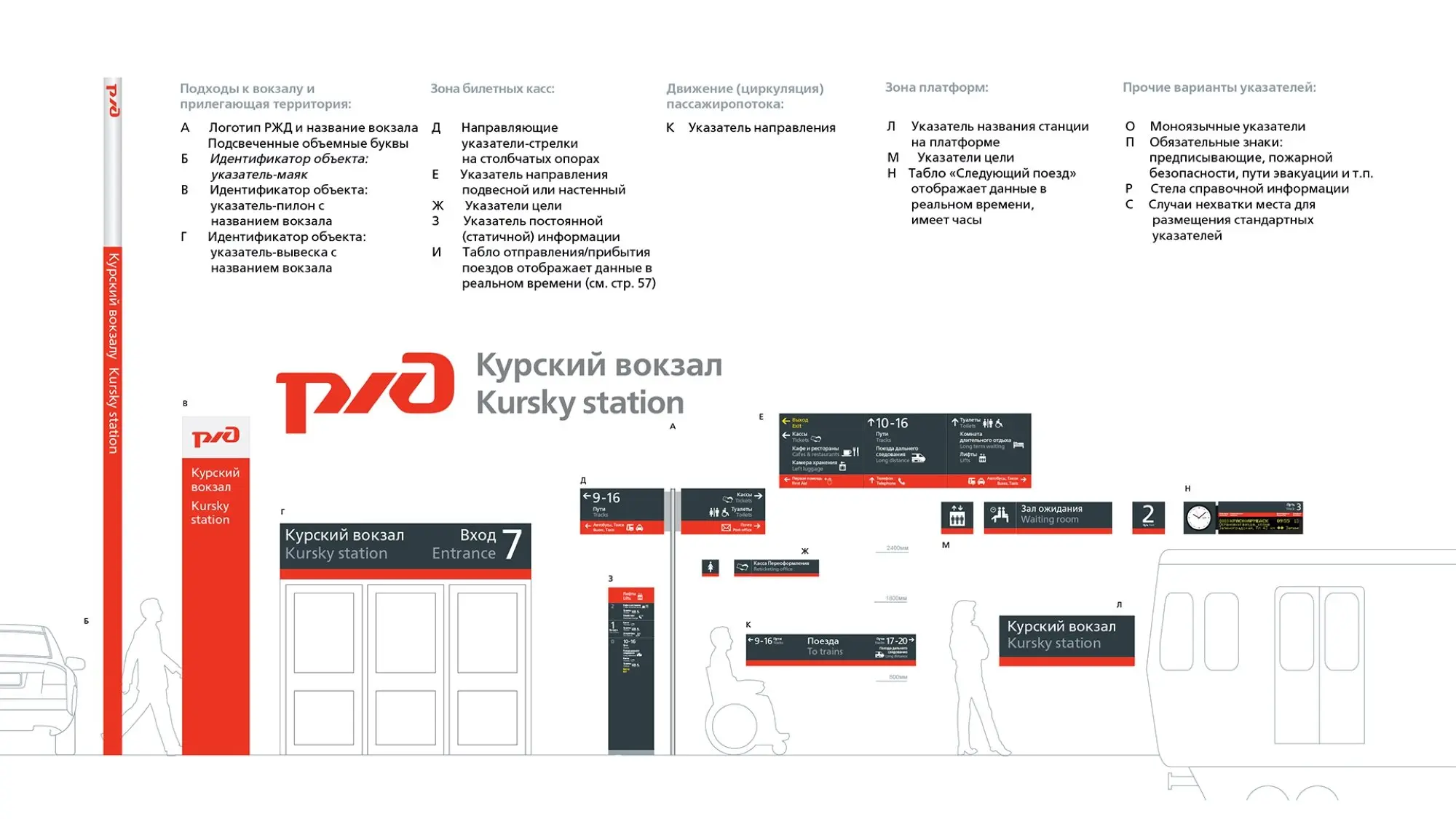
Each sign panel is divided into two colour sections – grey for the immediate primary information, with the red for secondary information. Platform information and station navigation are the principle and most visible legends in the grey section and then navigation relating to the onward journey from the station, in the red section. Signs are levelled within the environment at consistent datum heights for different sign types to ensure consistent information location within the network’s environments.
For manufacturing efficiency, colours were kept to a bare minimum. We have 3 – red, grey and white. These are also the RZD network brand colours. It was important to have strong dark colours as background with information reversed out in white because tests have shown that this combination performed superbly in whiteout snow conditions.
Typeface FSRailway was been developed specifically for the RZD wayfinding scheme and the chosen weight of ‘Book’ and its ‘Oblique’ cut, was selected for optimal legibility in both Roman and Cyrillic alphabets. The third language typeface selection (e.g. Mongolian) was governed by the closest matching modern typeface in that script.
The RZD pictograms were based on the international AIGA standard and cultural findings on the effectiveness of certain icon images. In order to achieve synergy with the typography, the pictograms were all specifically drawn with the distinctive characteristics of the FSRailway typeface.
The external signs are stove enamelled aluminium, giving them the necessary flexibility and durability to cope with serious temperature extremes, such a the -40 to +30 experienced in Yakutsk, Siberia. Furthermore, the internal signs were powdered coated and screened.
The system was also designed with standard fixed interchangeable components and sizes to enable recycling and easy alteration, lessening the need for additional sign manufacture. This long-life manufacturing process, the ease of assembly and recycling capability has made the system a cost-effective, sustainable and long-term solution – important when considering the scale of the network.
All spaced out in a comprehensive set of dual language guidelines.