
For our 21 from 21 series, today we decided to stay home in London and revisit the place branding, marketing communications and wayfinding we completed for Swiss Cottage in 2006……
When Camden Council first asked us to develop the place branding for Swiss Cottage our first thought was why is it called Swiss Cottage? How did it get its unique name? We searched for the answer in Camden Library by digging deep into their archives and discovering historical facts and details that even the clients themselves did not know about.
The story first began in the 19th Century during the Victorian times when the Swiss Opera, known as Le Chalet, made its mark in London. Proving to be widely admired by the British people, the London communities started to embrace all aspects of the Swiss culture by indulging in Swiss cuisine, adopting their fashion styles, and designing their building architecture like Swiss Chalets. That’s why the pub in the centre of the Swiss Cottage roundabout was designed like a Swiss Chalet, and it’s from that that the place got its name.
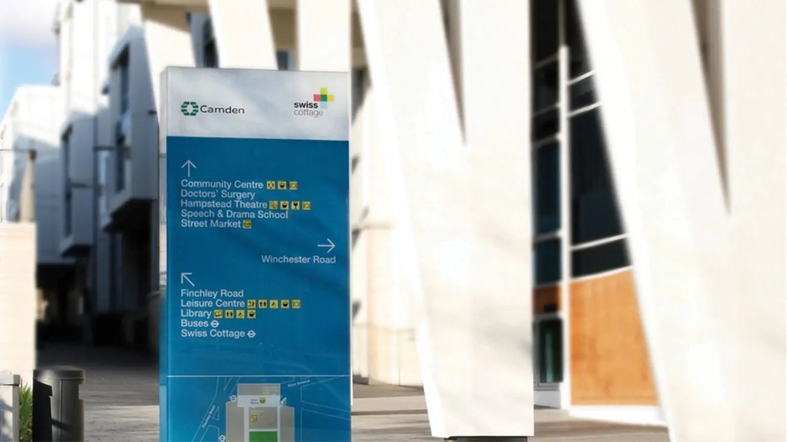
Jumping forward to the 21st century, Swiss Cottage was a place with rich Swiss history but difficult to define as an area. Camden Council decided to invest in a large-scale £100million urban regeneration project which was designed to reinvigorate this part of London; a place which was mainly remembered for its congested roundabout when in fact it was full of hidden pockets of charm, character and culture. The project involved a new 4-level leisure and sports centre, the refurbishment of Sir Basil Spence’s Library and Hampstead Theatre, and the design of a new public space which we designed the wayfinding for.
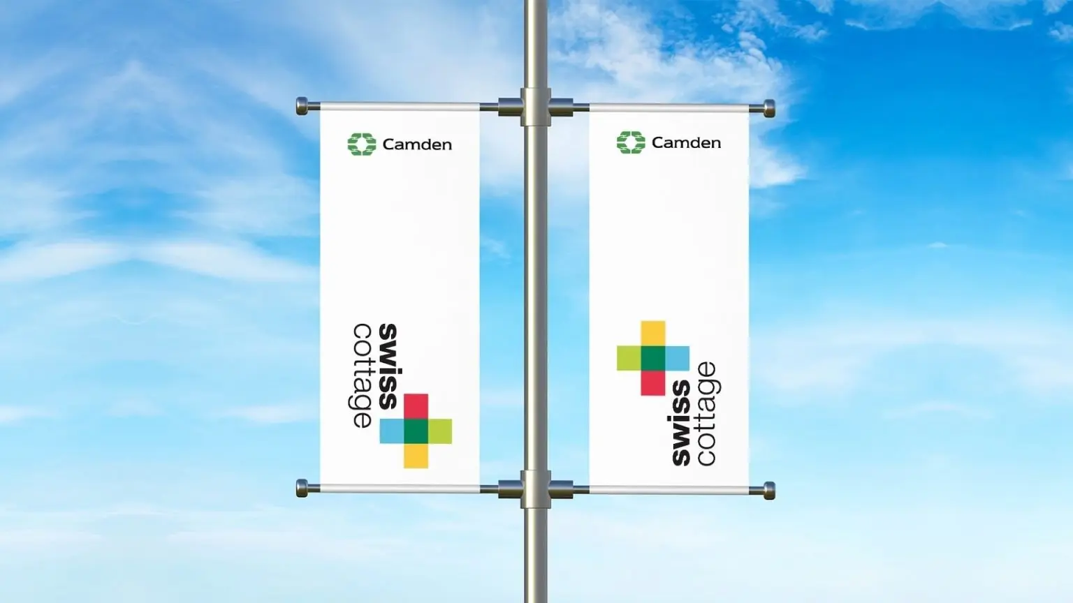
Air’s role in this story was to unify the diverse community services behind a new visual identity and communications strategy that delivered the message of change. However, we could not have achieved this goal alone: by engaging with our clients Andrew Dowell and Andrew Syer, local residents and stakeholders we were able to create a fresh identity and campaign that reflected the area’s vibrant spirit, quirky Swiss heritage and geography.
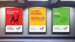
The logo design was inspired by the cross on the Swiss flag with four distinct colours to reflect and bring together the community’s special garden, leisure centre, theatre, and market. The Helvetica font used was developed by Swiss typeface designer Max Miedinger. Our marketing communications included bold and vibrant headings such as “Swiss is Changing” and “Swiss Is Happening” to create excitement and highlight the continuous evolution of the space.
By mixing interesting anecdotes about the area’s history with facts about its future plans, we were able to engage the local community in its redevelopment.